Window Functions in Scala: Time

Window functions are handy little tools that can be used to compute rolling averages, ranking by company or customer, and a host of other nifty things. But, they can be a little hard to comprehend, especially where dates and times are concerned.

In Scala, the easiest way to make time windows that don’t fall neatly on a day or year is using the rangeBetween function. Let’s use an example to illustrate.

The Set Up

First, let’s import the 2 scala packages you’ll need:

//import some built-in packages
import spark.implicits._
import org.apache.spark.sql.expressions.Window

Then, let’s create a simple dataframe. This creates a dataframe with integers representing unix timestamps for a handful of hours on 5-6-2018, along with temperature readings for 2 Northern Wisconsin cities.

//create a test dataframe
val testDF = Seq(
(1525567980,28.9, "Ashland"),
(1525569900,28.4, "Bayfield"),
(1525571580,28.9, "Bayfield"),
(1525575120,28.9, "Ashland"),
(1525578780,28.0, "Ashland"),
(1525582320,28.0, "Bayfield"),
(1525585980,28.0, "Bayfield"),
(1525589580,28.0, "Ashland"),
(1525591440,28.4, "Bayfield"),
(1525593180,28.0, "Ashland"),
(1525596780,28.0, "Bayfield"),
(1525600380,28.9, "Bayfield")
).toDF("uxt", "Temp", "City")

Next, we can make a time stamp from the integer that represents Unix time. This is just for readability.

//get a timestamp from the unix time
val testWithDates = testDF
.withColumn("Date", to_timestamp(from_unixtime($"uxt")))

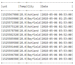
Now we have a usable dataframe. Feel free to look at what you’ve got by using the show() command:

testWithDates.show()

Table of Initial Data

Using rangeBetween

We’re ready to create a window. For this demonstration, we want a 1 hour window. In Unix time, that’s 3600 milliseconds. We’ll create the window by first ordering the data by the “uxt” column, and then creating a range that goes from 3600 milliseconds before this row’s timestamp to this row. This is a “look behind” sliding window. I’m using Window.currentRow here, but you can also specify the current row by using zero. That’s less intuitive to me, particularly when creating the window on a numeric column, so I prefer to use Window.currentRow. This code, then, creates a window that includes any rows that have a unix timestamp (“uxt” column) that are between the current row’s uxt value and the current row’s uxt value-3600.

//create a window for 1 hour - which is 3600 milliseconds in unix time.
val w = Window.orderBy(col("uxt")).rangeBetween(-3600, Window.currentRow)

Now that we have a window specification, we can use it to create new columns. Here, I’m creating a rolling 1 hour average, a minimum temperature, a maximum temperature and the count of the number of rows that are included in this window. I’m also creating a column that denotes the unix start of the window and a time stamp start of the window. And finally, I’m showing all the data.

val byRange = testWithDates
.withColumn("avgTemp", avg(col("Temp")).over(w)).orderBy(asc("uxt"))
.withColumn("minTemp", min(col("Temp")).over(w)).orderBy(asc("uxt"))
.withColumn("maxTemp", max(col("Temp")).over(w)).orderBy(asc("uxt"))
.withColumn("rowCount", count(col("Temp")).over(w)).orderBy(asc("uxt"))
.withColumn("uStart", col("uxt")-3600)
.withColumn("startDate", to_timestamp($"uStart"))
//show the data
byRange.show(truncate=false);

This results in output like this:
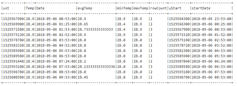
Table of data from the code example

This is a very small data set, and it’s relatively easy to follow along with what’s happening. The second row is less than an hour past the first row, so both the first and the second rows are included in the window. Likewise, the third row is less than an hour past the 1st and 2nd rows, and all three are included in the window. But the fourth row is more than an hour past the first 2 rows, so only the 3rd and 4th rows are included in that window. And so on. Note that the current row is always the end-point of the window, when using a look-behind window. We can visualize this data with windows for the 3rd and fourth rows. (Clicking on the visualization will open the interactive Tableau visualization in a new window.)

Adding a Partition

What if we wanted to look at a 2-hour window, by city. Easy! We can just add a partition to our window, and adjust the number of milliseconds. I’ve ordered the output by city and date, to make it a little easier to see what’s happening.

//create a window for 2 hours, partitioned by city
val wP = Window.partitionBy(col("City")).orderBy(col("uxt")).rangeBetween(-7200, Window.currentRow)
//add the aggregate columns
val byCity = testWithDates
.withColumn("avgTemp", avg(col("Temp")).over(wP)).orderBy(asc("uxt"))
.withColumn("minTemp", min(col("Temp")).over(wP)).orderBy(asc("uxt"))
.withColumn("maxTemp", max(col("Temp")).over(wP)).orderBy(asc("uxt"))
.withColumn("rowCount", count(col("Temp")).over(wP)).orderBy(asc("uxt"))
.withColumn("uStart", col("uxt")-3600)
.withColumn("startDate", to_timestamp($"uStart"))
.orderBy("City", "Date")
//show the data
byCity.show(truncate=false);

This gives you the following output:

Windowing with GroupBy

Using rangeBetween with unix time lets you have millisecond precision on the size of your windows. If you don’t need that kind of precision, you can also use windows with groupBy. Madahukar has written an excellent blog post on using windows with time and groupBy. Be careful, though. Watch what happens when we use groupBy to get the average, minimum and maximum for 1 hour:

//use window with groupby
val groupByWindow = testWithDates
.groupBy(window(col("Date"), "1 hour"))
.agg(avg("Temp").as("avgTemp"), min("Temp").as("minTemp"), max("Temp").as("maxTemp"))
.select("window.start", "window.end", "avgTemp", "minTemp", "maxTemp")
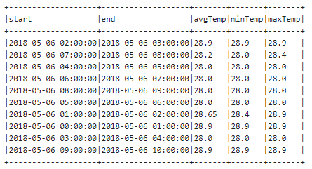
groupByWindow.show(truncate=false)

Using the groupBy function “rolls up” to the nearest whole value of whatever you are grouping by. This is great if you want an aggregate for each hour of the day (4 AM). It is not so great if you’re looking for more free-form windows (4:15 a.m to 5:15 a.m.).

Download the Code

If you’d like to run the example code in zeppelin, you can download the .json file.
Understanding a Maximal Margin Separator

Maximal Margin Separators

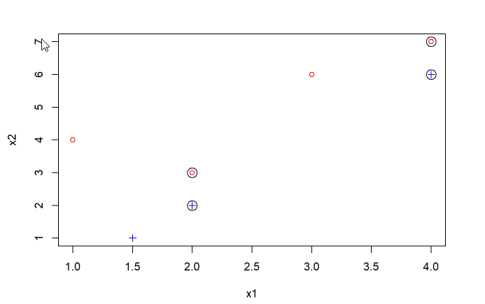
A Maximal Margin Separator (in a 2-dimensional space) is a hyperplane (in this case a line) that completely separates 2 classes of observations, while giving the most space between the line and the nearest observation. These nearest observations are the support vectors. In the plot below, the support vectors are the circled points. In this instance, the support vectors are evenly spaced, which means that maximal margin separator would be a line that falls halfway between each pair of support vectors and matches their slope. (In an instance where there are 3 support vectors, the line will parallel the slope of the side that has 2 support vectors.)

Scatterplot showing 2 classes of points.

Finding the line

Since we have a relatively simple plot, and we know what our support vectors are, we can find find the equation for the hyperplane by first finding the equation for the line.

x2 = m*x1 + b

Compare blue cross point (2, 2) to red circle point (2, 3). Notice that a point halfway (vertically) between them would be (2, 2.5). This is point 1 on our maximal margin separator. Compare blue cross observation (4, 6) to red circle observation (4, 7). Note that a point halfway between those two points would be (4, 6.5). This is point 2 on our maximal margin separator.

We can now compute the slope by dividing x22 – x21 by x12 – x11. That works out to (6.5-2.5)/(4-2) = 2. That’s our slope and we can sub that in for m in the equation:

x2 = 2 * x1 + b

We know what our points are. We can sub in either one to find our intercept (b). Subbing in the point at (4, 6.5), we get:

6.5 = 2 * 4 + b

or

6.5 = 8 + b

We can subtract 8 from both sides to get b:

6.5 – 8 = b – 8

-1.5 = b

So now we know that our line equation is:

x2 = 2 * x1 + -1.5

Equation for a hyperplane

A hyperplane equation looks like this:

beta0 + (beta1 * x1) + (beta2 * x2) = 0

with the caveat that (beta1^2 + beta2^2) = 1

Notice that the hyperplane equation has to equal zero. That’s so that all points above the hyper plane end up being postive, and all points below it end up being negative. We can then classify our points according to each class by whether they are positive or negative.

Let’s take this in steps:

First let’s fill in what we know from our point on the hyperplane and our linear equation. beta0 is our intercept, so fill that in.

-1.5 + beta1 x1 + beta2 x2 = 0

beta1 is our slope, so fill that in.

-1.5 + 2 x1 + beta2 x2 = 0

We know a point on our hyperplane is (4, 6.5), so we can fill in x1 and x2

-1.5 + 2 * 4 + beta2 * 6.5 = 0

Now we have to use algebra to solve for beta2. If you struggle with algebra, meet MathPapa’s Algebra Calculator. It will be your new best friend.

In this case, beta2 = -1.

Our hyperplane equation, discounting the caveat is:

-1.5 + 2(x1) + -1(x2) = 0

Dealing with the caveat

Now we have to deal with the caveat. We can use a normalization process called the l2 norm to find a scaling factor for all of our betas. We’ll only use beta1 and beta2 to find our normalization factor. But, then we’ll apply it to all three coefficients so that our entire equation continues to equal zero. You can prove to yourself that multiplying all the coefficents by the same factor works by running the following code (in R).

#set up our points
x1 = 4
x2 = 6.5

#set up w - this is a weight. 
#We're going to scale our equation by the weight
w = 1

#set up the initial equation
eq = -1.5/w + (2/w)*x1 + (-1/w)*x2 

#look at the inital value
eq


#loop from 1 to 10. 
#We'll divide our betas by the weight. 
#Eq will still equal zero (when rounded):

for (w in 1:10){
  eq = -1.5/w + (2/w)*x1 + (-1/w)*x2 
  cat("Loop ", w, " eq = ", eq, "\n")
  
}

The formula for the li norm is:

||y|| = sqrt(beta1^2 + beta2^2)

In our case that is:

||y|| = sqrt(2^2 + -1^2)

||y|| = 1.73205080757

You can prove to yourself that the caveat is met by checking your work:

w = 1.73205080757
2/w
-1/w

(1.154701^2) +(-0.5773503^2)

The final hyperplane equation

Whew! You almost at the end. Now, we have our weight and we need to scale all three betas by our weight.

w = 1.73205080757

-1.5/w
2/w
-1/w

Our final hyperplane equation is:

-0.8660254 + 1.154701(x1) + -0.5773503(x2) = 0

If we fill in our known point (4,6.5) again, we can check our work:

#verify that this equals 0
round(-0.8660254 + 1.154701*x1 + -0.5773503*x2)

#verify that this equals 1
round((1.154701^2) + (-0.5773503^2))

How big is the margin

We have to do one final step to determine how big the margin is. Easy. We know what the points on the margin are. These are our support vectors above. Choose one. Let’s choose the the red circle at (4,7).

All we have to do is plug in this point on the margin and run our hyperplane equation again. Since this is a point above the hyperplane, we multiple the result by -1 to get the positive margin.

x1 = 4
x2 = 7

-1*(-0.8660254 + 1.154701*x1 + -0.5773503*x2)
## [1] 0.2886735

Checking for a Resolved People Picker Before Submit

The Situation

In SharePoint 2010, when you have a list that allows attachments and also has required fields, if not all the required fields are filled out, the attachments disappear when the page reloads to display error text. This is a known bug, but you can work around it by doing custom validation with PreSaveAction(), ensuring that all required fields are filled out before submission. But, if you have a people picker field, the resolution of the entered name happens asynchronously, and might not resolve before PreSaveAction runs.

The Solution

By combining SpServices.SPFindPeoplePicker and some custom jQuery, you can make sure that the people picker has resolved before the form submits.

The Code

Assuming you have a people picker field names “Contact Person” use SpServices to get a handle on the field and call checkNames to start resolving the people picker.


var contactPerson = $().SPServices.SPFindPeoplePicker({
peoplePickerDisplayName: "Contact Person",
checkNames: true
});

When a people picker resolves, it adds a span with the class “ms-entity-resolved” to the row. You can then look for that span to make sure that a name has been entered and resolved.


if (typeof contactPerson.row.find("span[class='ms-entity-resolved']").html() == 'undefined') {
contactPerson.row.find("td[class='ms-formbody']").append('

Please enter a contact person. Click the checkmark and wait for the name to resolve before saving your work.

');
errorCount++;

}

The code above will add a descriptive error after the description for the people picker.

Be sure to give your users a descriptive error so that if the people picker resolves in the meantime, they'll know what to do.
Be sure to give your users a descriptive error so that if the people picker resolves in the meantime, they’ll know what to do.

Assuming this is your only required field, here’s the entire PreSaveAction function.


function PreSaveAction() {
//clear the errors
$('div.ms-formvalidation').remove();

// set an error count;
var errorCount = 0;

//check for contact person
var contactPerson = $().SPServices.SPFindPeoplePicker({
peoplePickerDisplayName: "Contact Person",
checkNames: true
});

if (typeof contactPerson.row.find("span[class='ms-entity-resolved']").html() == 'undefined') {
contactPerson.row.find("td[class='ms-formbody']").append('

Please enter a contact person. Click the checkmark and wait for the name to resolve before saving your work.

');
errorCount++;

}

if (errorCount == 0){
return true;
}
else {
return false;
}

} // end presaveaction

I also run check names on change of the field following the people picker in my form, which hopefully gives the async function time to return before you get to PreSaveAction. In this example, the following field was a table of radio buttons, and I ran check names on click:


// try to resolve the contact person whenever someone clicks a button in the approval group
$('table[title="Theme"] :radio').bind("click", function(){
//check for contact person
var contactPerson = $().SPServices.SPFindPeoplePicker({
peoplePickerDisplayName: "Contact Person",
checkNames: true
});

});

Replacing Multi-select Lookup field with Checkboxes

The Situation

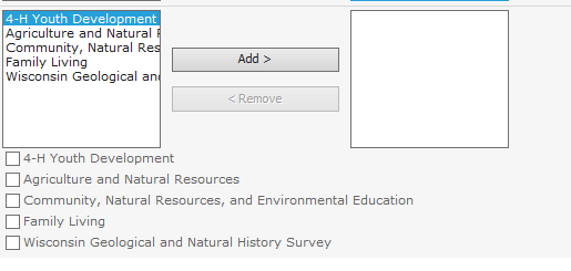
In SharePoint 2010, when you create a lookup field that allows for multiple selections, you end up with a very non-standard html widget that includes 2 boxes for moving “possible” values to “selected” values. Like so:

Out of the box Multi-select UI

That’s all well and good if you have short values and a long list of them. But, if you happen to have long values and a short list of them, SharePoint’s UI choice is less than spectacular. As you can see in the image, most of the values are hidden in the select box. Marc Anderson has a function in his popular SpServices library to resize the select boxes to show the complete value. But, that’s not always preferable – as that can make your page very, very wide.

The Solution

Wouldn’t it be nice if you could just make a checkbox interface instead of the multi-select interface? Why, yes, yes it would. And now you can. There are a few moving parts here. I’ll try to break it down.

First, we need a way to select and unselect choices in the multi-select UI. It’s not as easy as just highlighting a value and using jQuery to “click” the add or remove button. Believe me, I tried that. Happily, I found someone else that grappled with this issue, and he got me most of the way there. I had to tweak a couple of things, because I had multiple multi-select fields on a single form, and because I know my users well enough to know that they’ll go crazy checking and unchecking things. So, here are my add choice and remove choice functions.

Add Choice

function addChoice(text, columnName) {

	// let's get the id from the column name
	var thisID = $("[title='" + columnName + " possible values']").prop('id');
	thisID = thisID.substr(0, thisID.indexOf('_SelectCandidate'));
	selector = "[id$=" + thisID + "_MultiLookupPicker]";
    $("[title='" + columnName + " possible values'] option").each(function () {   
        if ($(this).text() == text) {
            $(this).appendTo($("[title='" + columnName + " selected values']"));

            var multilookupPickerVal = $(selector).val();
            if ($(selector).val() == undefined || $(selector).val().length == 0) {
                $(selector).val($(this).val() + "|t" + $(this).text());
            }
            else {
                $(selector).val(multilookupPickerVal + "|t" + $(this).val() + "|t" + $(this).text());
            }
        }
    });
}

Remove Choice

function removeChoice(text, columnName) {
// let's get the id from the column name
	var thisID = $("[title='" + columnName + " selected values']").prop('id');
	thisID = thisID.substr(0, thisID.indexOf('_SelectResult'));
	selector = "[id$=" + thisID + "_MultiLookupPicker]";

	// loop through the selected options
    $("[title='" + columnName + " selected values'] option").each(function () {

        if ($(this).text() == text) {
            $(this).appendTo($("[title='" + columnName + " possible values']"));

            var multilookupPickerVal = $(selector).val();

            // call the internal function which creates a clean array out of the weird string
            var splitValue = GipSplit(multilookupPickerVal);

            // set the 2 array nodes we want to remove
            var valToRemove = $(this).val();
            var textToRemove = $(this).text();

            // Kill the value and text in the array
            splitValue = jQuery.grep(splitValue, function(value) {
        		return value != valToRemove;
      		});

      		splitValue = jQuery.grep(splitValue, function(value) {
        		return value != textToRemove;
      		});

      		var newValue = '';

      		// loop through the cleaned up array and rebuild the selector value
      		for (var i = 0; i < splitValue.length; i++) {
      			if (newValue.length == 0) {
      				newValue = splitValue[i];
      			}
      			else {
      				newValue = newValue + '|t' + splitValue[i];

      			}

			 } // end for loop

          	// set the new value to the selector
            $(selector).val(newValue);

        }
    });
}

Next, we need a function to draw the checkboxes to the screen. I wanted to make this as simple as possible, so this same function draws the checkboxes, hides the old UI, and attaches the remove and add choice functions to the click events of the checkboxes.

Draw Checkboxes

// function used to draw the checkboxes instead of a multi-select lookup
function drawCheckboxes(columnName) {

	// remove spaces from columnName
	var divName = columnName.split(' ').join('') + 'Checkboxes';

	// find the parent td, hide the span, clear the div
	$('div[id="' + divName + '"]').remove();
	$("[title='" + columnName + " possible values']").closest('span').after('<div id="' + divName + '">New div</div>');
	$("[title='" + columnName + " possible values']").closest('span').hide();
	var thisDiv = $('div[id="' + divName + '"]').html('');

	// loop through all the possible options and draw the checkboxes
    $("[title='" + columnName + " possible values'] option").each(function () {
        var thisText = $(this).text();
        var thisVal = $(this).val()
        var thisSnippet = "<input type='checkbox' name='" + columnName + "' value='" + thisText + "' id='" + columnName + "Checkbox" + thisVal + "'/><label for='" + columnName + "Checkbox" + thisVal + "'>" + thisText + "</label><br/>";

        thisDiv.append(thisSnippet);
    });

    // loop through all the selected options and draw the checkboxes
    $("[title='" + columnName + " selected values'] option").each(function () {
        var thisText = $(this).text();
        var thisVal = $(this).val()
        var thisSnippet = "<input type='checkbox' name='" + columnName + "' value='" + thisText + "' id='" + columnName + "Checkbox" + thisVal + "'/><label for='" + columnName + "Checkbox" + thisVal + "'>" + thisText + "</label><br/>";

        thisDiv.append(thisSnippet);
    });

    // Loop through the checklist for outcome statement lookup 

	var boxes = $('input[name="' + columnName + '"]');
	boxes.each(function(index) {

	$(this).click(function() { 
		// get the label

		if( $(this).is(':checked')){
			addChoice($(this).val(), columnName);
		}
		else {
			removeChoice($(this).val(), columnName);
		}
	});

	});  // End loop

} //end draw checkboxes

The basic solution

Great – now we have functions that will draw checkboxes and add and remove choices when the checkboxes are clicked. What do you do with it? First put all your scripts together in a text file and upload your text file to your site. (Note, there is one line you’ll need to edit in this text file.) (I typically use the site assets library.) On your page with your data form web part, you’ll need to include a content editor web part and link to your text file.  Run your page, and voila – checkboxes! (Note that in this image, I’ve shown both interfaces.)

Showing both the standard and checkbox UI.

Of course, around here, we’re integrating this with SPServices, to filter the multi-select. For that, you need a few more steps. First, you’ll need a copy of SPServices in your site, and you’ll need to include a reference to SPServices in your text file. Next, you’ll need to make a function that will work as a call-back to the SPServices.SPFilterDropdown or SPCascadeDropdowns function. Functions passed as callbacks can’t have parameters (at least, I haven’t figured out how to do it). So, you’ll need a wrapper function for drawCheckboxes that passes in the column you want. This is convenient because you can also do other stuff at the same time, if need be. Here’s my example, using a filter.

Wrapper Function

// need this function to pass a parameter-free function to the complete function of the dropdown filter
function drawProgramAreaCheckboxes() {
	drawCheckboxes("Collaborators Program Area");	
}
//end drawProgramAreaCheckboxes

Calling the SpServices Filter function with callback

//Filter and draw checkboxes for program areas
$().SPServices.SPFilterDropdown({
  relationshipList: "Program Area",
  relationshipListColumn: "Title",
  relationshipListSortColumn: "ID",
  columnName: "Collaborators Program Area",
  CAMLQuery: " 1",
  completefunc: drawProgramAreaCheckboxes,
  debug: true
});

//End program areas

Here’s the complete file for using checkboxes with SpServices. Note, there are multiple parts you’ll need to customize in here.

Editing Forms

Now that we have adding forms figured out, we need to do something about editing. It’s essentially the same, but you need to set the checkboxes that require setting. Again, for this, we’re using SPServices, and we need a few more function calls.

Step one – helper functions to set checkbox values

We need a couple of helper functions to set the checkboxes. The first sets a checkbox’s selected property to true based on the value of the checkbox.

function checkByValue(value) {

	$(":checkbox").filter(function() {
        return this.value == value;
    }).prop("checked", "true");

}

The second takes in a string as returned by spSpervices GetListItems for multi-select fields and the column name and loops through the string, setting each checkbox. The string returned is a series of ID’s and values, separated by semi-colons and hash tags. So, we’ll split the string on the ;# combo, and then check only when we have a value, not a number. Caveat – if your values ARE numbers, this won’t work for you, and you’d need to do check every other value, instead of the textual values.

function setMultiSelectValueCheckboxes(inString, column) {

 	var outString = inString.split(";#");

 	$.each(outString, function( index, value ) {

		  if (isNaN(value)) {

		  	checkByValue(value);
		  }
	});

} // end set MultiSelectValueCheckboxes

Step two – get the ID from the query string.

SpServices has a helper function that lets you get parameters from the query string. SharePoint always passes an ID parameter to edit forms. So, you just need to grab it, like so:

// This function from SPServices gets all of the Query String parameters 
  	var queryStringVals = $().SPServices.SPGetQueryString();
  	var effortID = queryStringVals.ID;

Step three – build the checkboxes

Just like in the add scenario, you’ll need to build your checkboxes. You want to build them before you try to check them, or this won’t work. For brevity, you can refer to the completed text file for this section, since it’s no different than the add form.

Step four- use GetListItems to get the thing you’re editing

My test list is called “Educational Effort.” Here I’m passing in a CAML query to get just the item we’re editing. I’ve returned more viewfields than you’d really need. But, you get the idea. If we have a successful status, we then set the value of the checkboxes, using our helper function from above.

// Get the related effort
		$().SPServices({
		    operation: "GetListItems",
		    async: true,
		    listName: "Educational Effort",
		    CAMLQuery: "" + effortID + "",
		    CAMLViewFields: "",
		    completefunc: function (xData, Status) {

				if (Status == 'success') {

				$(xData.responseXML).SPFilterNode("z:row").each(function() {

 				// get outcome statement and program area values
		        var outcomeStatementLookup = $(this).attr("ows_OutcomeStatementLookup");
		        var collaboratorsProgramArea = $(this).attr("ows_CollaboratorsProgramArea");

		        // set checkboxes
				setMultiSelectValueCheckboxes(outcomeStatementLookup, 'Outcome Statement Lookup'); 
 				setMultiSelectValueCheckboxes(collaboratorsProgramArea , 'Collaborators Program Area'); 

		      });	// end each function	
		      } //end if status = success.		
		    } // end complete function
		  }); // end spservices
// End get the related effort

And, voila – automatically checked checkboxes.

Edit page with auto-checked checkboxes.

Here’s the complete file for an edit form. Again, note that you’ll need to customize for your environment.

As usual, feel free to point out places where this could be optimized, tweaked, etc. I’ve testing in IE 10, Chrome and Firefox, and it seems to be working for me.

Linking a Multi-Select Lookup Column (XSLT Solution)

The Problem

A common issue in SharePoint 2010 is dealing with linking 2 lists via a look-up column. That’s easy-peasy.

But, what happens when you want to display a view of a record in the main list? By default, you get a semi-colon delimited list of the items from the look-up list, each linked to their record in the look-up list.

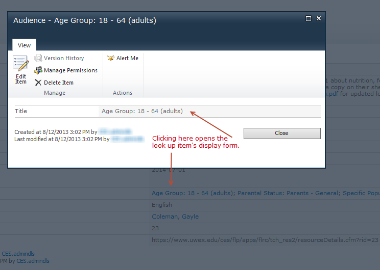
Here’s what the standard behavior looks like:

The standard behavior - opening the related item's display form.
The standard behavior – opening the related item’s display form.

That might be fine in some instances, but what if you want to do something a bit more user-friendly? For example, what if you want to link each look-up item to a page that displays the look-up item’s data and some related data?

Well, you could do that by customizing the standard display page of the look-up table. But, if you do that, you’ll still get the edit ribbon for the look-up item. I’m not a huge fan of the edit ribbon.

I’d rather my users have a more standard web experience. So, I want to link each look-up item to a custom web part page, that pulls in data based on the ID of the item.

The Solution

The best way that I’ve found to do this is to create a custom XSL template, and apply it to the output of your multi-select look-up column in a Data View Web Part. There are a couple of things to understand about how multi-select look-up columns work.

  • For each column of this type, there are 2 data fields returned in a DVWP datasource. One of the fields includes the links to the item’s display form. The other field does not.
  • The field you want to use with the custom XSL Template below is the one that does not already contain links.
  • The field you want will always be the field name with a period (.) appended to the end.
  • This field will contain data that looks like so: ID;Title – where the ID is the numeric ID of the item and Title is the actual title of the item. (or whichever field you used for the look-up).

The always helpful Marc Anderson already had a great sample template out there for handling a similar problem. I just took his template 1 step further.

Here’s the code:


<xsl:template name="MultiSelectDisplay">
<xsl:param name="MultiSelectValue"/>
<xsl:param name="MultiSelectDelimiter"/>
<xsl:param name="MultiSelectSeparator"/>
<xsl:param name="Link"/>
<xsl:param name="ThisID" select="0" />
<xsl:choose>
<xsl:when test="contains($MultiSelectValue, $MultiSelectDelimiter)">
<xsl:variable name="before" select="substring-before($MultiSelectValue, $MultiSelectDelimiter)"/>
<xsl:choose>
<!-- if we have a number, pass it back, but don't display anything -->
<xsl:when test= "string(number($before))!='NaN'">
<a>
<xsl:attribute name="href">
<xsl:value-of select="$Link"/><xsl:value-of select="$before"/>
</xsl:attribute>
<xsl:call-template name="MultiSelectDisplay">
<xsl:with-param name="MultiSelectValue" select="substring-after($MultiSelectValue, $MultiSelectDelimiter)"/>
<xsl:with-param name="MultiSelectDelimiter" select="$MultiSelectDelimiter"/>
<xsl:with-param name="MultiSelectSeparator" select="$MultiSelectSeparator"/>
<xsl:with-param name="Link" select="$Link"/>
<xsl:with-param name="ThisID" select="$before"/>
</xsl:call-template>
</a><br/>
</xsl:when>
<!--Otherwise, display and then pass back -->
<xsl:otherwise>
<xsl:value-of select="concat($before, $MultiSelectSeparator)" disable-output-escaping="yes"/>
<xsl:call-template name="MultiSelectDisplay">
<xsl:with-param name="MultiSelectValue" select="substring-after($MultiSelectValue, $MultiSelectDelimiter)"/>
<xsl:with-param name="MultiSelectDelimiter" select="$MultiSelectDelimiter"/>
<xsl:with-param name="MultiSelectSeparator" select="$MultiSelectSeparator"/>
<xsl:with-param name="Link" select="$Link"/>
</xsl:call-template>
</xsl:otherwise>
</xsl:choose>
</xsl:when>
<!-- Display the last item in the list -->
<xsl:otherwise>
<xsl:value-of select="$MultiSelectValue"/>
</xsl:otherwise>
</xsl:choose>
</xsl:template>

Or, in a pretty picture, because WordPress doesn’t do code includes very well:

Image Version of the Template - pretty colors!
Image Version of the Template – pretty colors!

To call the code, in your DVWP, include this bit, passing in the relevant parameters:

<xsl:call-template name="MultiSelectDisplay">
<xsl:with-param name="MultiSelectValue" select="@Audience1."/>
<xsl:with-param name="MultiSelectDelimiter" select="';#'"/>
<xsl:with-param name="MultiSelectSeparator" select="'<br />'"/>
<xsl:with-param name="Link">/tools/wnepresources/SitePages/Resources%20by%20Audience.aspx?AudienceID=</xsl:with-param>
</xsl:call-template>

And, again – the pretty picture of the code version:

How to call the XSLT from within your DVWP.

When you include the “MultiSelectDisplay” template in the DVWP’s stylesheet, and call it, you will get output like so:

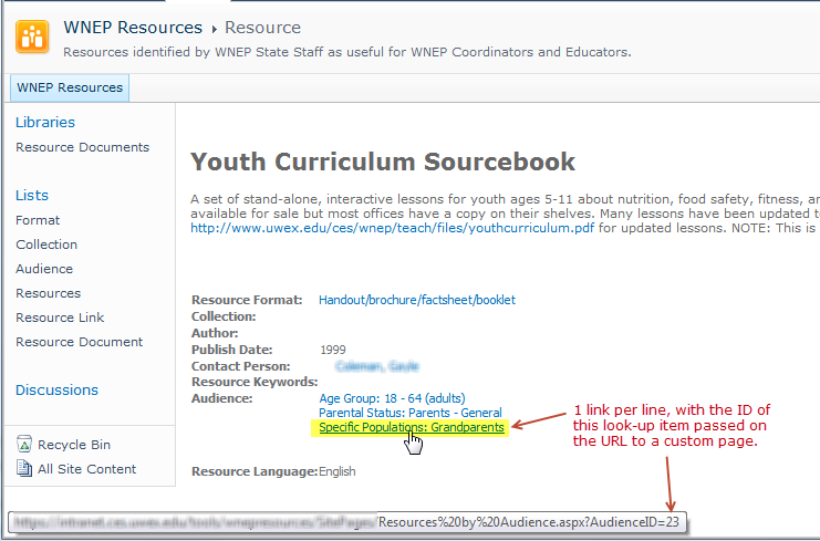
Finished Solution - 1 item per line, linked to a custom page.
Finished Solution – 1 item per line, linked to a custom page.

Happy Coding!

Removing the Comma from a Group Header in a SharePoint 2010 List View

This Situation

You have a list with a “year” column of type numeric, so that it will do a proper numeric sort. (While you can use calculated columns to format numeric columns like a text column, you lose your numeric sorting capabilities.) You have a view grouped by year. SharePoint displays the year with a comma. Like so:

Year Displayed with a Comma

The Solution

It’s time to open SharePoint Designer. Click “Lists and Libraries” in the Site Objects panel. Click your list. Find your view in the “views” panel. Click your view to edit it. Find your header. Right click the header and select “Edit Formula.”

Right Click Your Year and Select "Edit Formula"
Right Click Your Year and Select “Edit Formula”

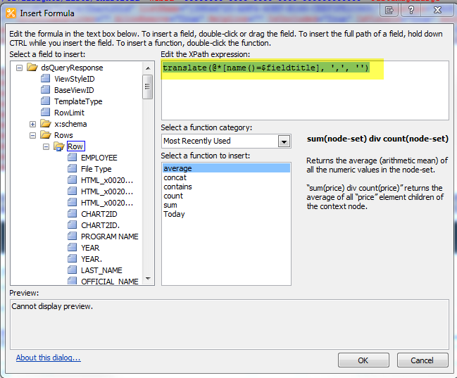
Set your formula to be:


translate(@*[name()=$fieldtitle], ',', '')

Like so:

Edit Your Formula to Add the Translate Function

And, that should do it!
This adds a lot of XSLT to your page that is designed to allow for different types of group headers. In this case you know what your group header is going to be, and you could probably clean up some of the XSLT for faster performance. I’ve yet to do that, though. If you do, let me know!

Note: If you need to just remove the comma in a column of data (not a header) the approach here works. His number-format formulas did not work for me in the header.

Assigning Permissions to a Group Via SPD Workflow

The situation

You have a list or library. You want all authenticated users to be able to add items to the list. But, once the item is created, you need to limit permissions to a certain subset of users, based on a column in the list or library. In my example, I have an event registration list. When an item is added to the list, permissions should be restricted to a county security group based on the county chosen in the event registration.

The Solution

    1. Set up your county list. It should have 2 columns: title, group. Group is person column set to the security group.

      Look-up List - title and group columns
      Look-up List – title and group columns
    2. Set up your event registration list. Include a county column which is a lookup to the list you created in step 1. I based my list off of a content type, so that I could do a reusable workflow. You can also use a list workflow, though.

      The main list - including the lookup column.
      The main list – including the lookup column.
    3. In SharePoint Designer, create a workflow. Create an impersonation step. (This needs to be done outside step one. Also, it’s best practice to create a workflow user that has the appropriate permissions and to log in to SPD with the workflow user to author the workflow. Impersonation steps run as the workflow author.)
    4. Inside the Impersonation Step, click Action -> Set a Workflow Variable.
      1. Name your variable “County” to match your lookup list.
      2. Click on “value” to set the value. Click the “fx” button.
      3. In the “Find Data To Retrieve” section, set the Data source field to your lookup list. Set the Field from Source field to the security group column in your lookup list. Set the Return field as to “As String.”
      4. In the “Lookup for Single Line of text” section, set the Data source to “Current Item.” Set the Field from source field to your lookup column in the current item list (county in my case). Set the Return field as field to “Lookup Value (as Text).”
Using the lookup field to set the security group variable.
    1. Select Action -> Replace List Item Permissions. Click “these permissions.” Click “Add.” Click the permissions you want to replace. In my case, it was “Contribute.” Click “Choose.” Click “Workflow lookup for a user.” In the “Field Data to Retrieve” section, set the Data source to your lookup list. Set the Field from source to your “Group” column. Set Return field as to “String.” In the “Find the List Item” section, set your field to your “Group” field. Click the “fx” button. In the “Lookup for Person or Group” dialog, set your Data source to “Workflow Variables and Parameters.” Set your Field from source field to the variable set in step 4. Set Return field as to “As String.” Click “ok” on all dialog boxes. Click “this list” and select “Current Item.” Repeat these steps for each set of permissions you want to replace.

      Return the security group matched to the local variable.
      Return the security group matched to the local variable.
    2. Your complete workflow should look something like this. (Note, I added a couple of log messages not defined in the steps. Feel free to add them or leave them out.

      Complete Workflow
      Complete Workflow
    3. Publish and test your workflow. I set mine to run automatically whenever a new item is created. Test your permissions.

Creating Open & Close Dates for a Browser-based InfoPath Form in SharePoint 2010

The Situation

We often use forms to collect data. Sometimes, we need to limit the time during which people can submit data to a certain set of open and close dates. It’s certainly possible to go change permissions on the underlying list or library to take away contribute permissions when outside the open time period. But, that relies on a person remembering to do it on time, and it’s confusing for people to have the UI change (no more “add new item” option) with no explanation of what’s going on. Also, when building forms for less tech-savvy site owners, changing permissions can be confusing.

The Solution

Using a combination of SharePoint lists and InfoPath forms, it’s possible to create a solution that is easy for site owners to manage and gives clear and concise information to end-users.

The Set Up

You’ll need 2 lists.

The Open/Close List.

Create a custom list. I called mine “Open and Close Dates.” This list should have 3 columns – the title, the open date (date & time column) and the close date (date & time column). The title will be used to filter the open/close dates when we pull them into the InfoPath form, so that you can open and close more than 1 form with the same list.

The list for setting the open and close dates.

The form list

In my case, I’m using a custom list with a custom content type. But, it should work for any custom list.  There are a couple of important settings here. First, on list settings -> advanced settings, make sure that Datasheets are disabled. Otherwise, users will be able to circumvent your InfoPath form.

Make sure bulk edit is not allowed.

Second, since none of this magic happens without InfoPath, we want to click the “Customize Form” button to customize the form used with the list in InfoPath Designer.

Click the "Customize Form" button to open InfoPath Designer
Click the “Customize Form” button to open InfoPath Designer

The InfoPath Magic

Once in InfoPath, there are a few steps to get this all working.

  1. Set up a data connection to your “Open and Close Dates” list. (For step-by-step directions with pictures for creating a connection to a SharePoint List, check out Wonder Laura’s post.)
    • Click the “Data” tab and click “From SharePoint List”.
    • Enter the site URL.
    • Select your open/close list.
    • Check off the following: Title, Open Time, Close Time (sorting is irrelevant in this case)
    • Name your data connection whatever you’d like.
  2. Create Open and Closed fields and set their default values
    While we can pull the open and closed fields from the data connection we created in step one, there are places where we can’t filter on the fly if we have more than one value in the open/close list. So, we need to create open and closed fields in our main data connection, or in a dummy one. I did it in the main data connection, because I don’t really care if we have a couple extra columns of data in our form list. But, if you’d prefer to set up a dummy data connection, John Liu has a great post on doing that. Here’s what I did.

    • In the main data connection, click “Add Field”.

      Add a Field to the Main Data Connection
      Add a Field to the Main Data Connection
    • Set the display name to “open.”
    • Click the “fx” button for the default value.
    • Select “Insert Field or Group.”
    • Click “Show Advanced View.”
    • Choose the Open and Close Dates datasource.
    • Open the “dataFields” folder.”
    • Select “Open Time.”
    • Click “Filter Data.”
    • Click “Add.”
    • Select “Title” in the first drop down and set it equal to whatever text you set in as the title in the list.
    • Click “Ok” on all the open dialog boxes.
    • Your field properties should look something like this:

      Example of the "open" field.
      Example of the “open” field.
    • Repeat process to create a “closed” field.
  3. Create a “Closed” view.
    • Click the “Page Design” tab.
    • Click “New View.
    • Enter a name. (I called mine “Registration Closed.”)
    • Type whatever “form closed” message you want. Mine pulled in the open close dates and displayed them, like so:

      Sample "Closed" View
      Sample “Closed” View
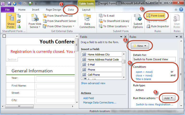
  4. Set Form Load Rules
    Steps to set a form load rule to switch views to "closed form" view.
    Steps to set a form load rule to switch views to “closed form” view.
    • Click the “Data” tab.
    • In the “Rules” section, click “Form Load.”
    • Click “New” and select “Action.”
    • In the “Conditions” section, click “None” to set conditions.
    • You need 3 conditions: open > now() OR close < now AND title is blank. (Open and Close are the fields in the main data connection that you set up in Step 2. Ensuring that title is blank means this will only run when a new form is loaded.)

      Form Load Conditions
      Form Load Conditions
    • In the “Run these actions” section, click “Add” and select “Switch Views.”
    • Select your “Registration Closed” view.
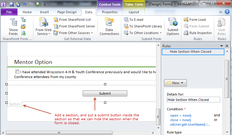
  5. Add a Submit Button to the “Edit Item (default)” View
    In our next step we’re going to remove the InfoPath buttons. So, our users need a way to submit their data, but only when the form is “open.”

    Add a Submit Button inside a section. Hide the section when form is closed.
    Add a Submit Button inside a section. Hide the section when form is closed.
    • At the bottom of the form, add a new section. (Home Tab -> Controls -> Containers -> Section)
    • In this section, add a button.
    • Right click on the button and select “Button Properties.”
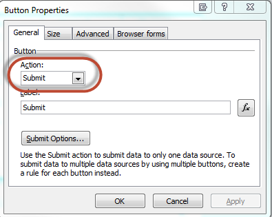
    • Set the Action to “Submit.” You can modify the label if desired, or leave it as the default.

      Submit Button Properties
      Submit Button Properties
  6. Hide the Submit Button Section when form is closed.
      • Click on the section tab, and click “Manage Rules.”
      • Click “New” and select “Formatting.”
      • Click “None” under “Condition” to open a menu for setting conditions.
      • Here we need 2 (or possibly 3) conditions. The 2 that are a must are: open > now() AND close < now(). If you have an administrator that should always be able to edit data, you’ll want to add a third condition. This one is “OR xdUser:get-Username() != “youradminusername.”
    Set the rules to hide the submit button section when closed and not being viewed by an admin.
    Set the rules to hide the submit button section when closed and not being viewed by an admin.

    Check the “Hide this control” checkbox.

  7. Create a “Registration Closed” notice on the form.
    Create a section at the top of the form to indicate closed status.
    Create a section at the top of the form to indicate closed status.
    • At the top of your form, create another section. (Home Tab -> Controls -> Containers -> Section)
    • Add a message to indicate registration is closed. Mine says, “Registration is currently closed. You can not submit or edit registrations at this time.”
    • Click on the section tab, and click “Manage Rules.”
    • Click “New” and select “Formatting.”
    • Click “None” under “Condition” to open a menu for setting conditions.
    • On this section, you need the opposite conditions as the submit button, because you want this one hidden when the form is open. So, you need: open < now() AND close > now(). If you don’t want the administrator to see it, then you need the expression “xdUser:get-UserName() != ‘YourAdminUser’.”

      Conditions for the form closed notification.
      Conditions for the form closed notification.
  8. Remove the Infopath buttons.
    • Click the “File” tab.
    • Click “Form Options.”
    • Click “Web Browser.”
    • Uncheck “Show InfoPath commands in Ribbon or toolbar.

      Uncheck InfoPath Commands in the Form Options
      Uncheck InfoPath Commands in the Form Options

The Finished Product

With everything set up, when users come to the site, they will always be able to click the “Add New Item” button on the list, but if data collection is closed, they’ll receive a friendly message with an explanation.

Closed notice displayed when add new item is clicked.

When a user attempts to edit an existing registration, they’ll be notified that the registration is closed, and there will be no submit button for saving changes.

Editing a closed form shows the notice and removes the submit button.

The Caveats

Hey, it’s SharePoint. You know there are some.

What I’d really like to be able to do is to determine the state of the form when it opens. Is it in edit or view mode? If in edit mode & registration is closed, switch to the closed view. If it’s in view mode, don’t. Alas, I’ve yet to be able to figure that one. Got any ideas?

SP2010: Using PreSaveAction on Custom Forms

The Situation

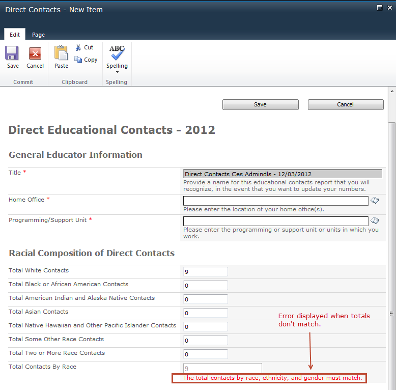
You have a list that has list-level validation. But, you need to use a customized new item or edit item form. The validation routine fires on the server, but the custom new and edit forms do not show the associated error. While you could handle your validation with a workflow or a custom event receiver, there’s a simpler way.

The Work-Around

In addition to the existing list-level validation, you can add client-side validation by hooking into the PreSaveAction function. In my particular case, I had three columns that needed to equal each other. There are several moving parts involved.

  1. In the custom new item and edit item forms, create a div to show or hide errors. Default it to not being shown when the page loads. Include your standard error text. (NOTE: You can modify the error text via your JavaScript function later on, if you have multiple validations to run.)
    <div class="ms-formvalidation FormErrors" style="display: none;">The total contacts by race, ethnicity, and gender must match.</div>
  2. In the custom new item and edit item forms, add a call to the PreSaveAction function in the code on the page. (NOTE: You can’t include this as an external file. It must be on the page itself.)
    <script>
    // Stupidly, this function can't be included in an external file, so we'll call the function here and just return another function from the external file.
    function PreSaveAction() {
    return PreSaveExternalAction();
    }
    </script>
  3. In a text file in SiteAssets, create your corresponding validation function. (Note: your function can not be inside a $(document).ready(function(). It won’t be called if it is. The name of the function in your external file should match the name of the function returned by the PreSaveAction function.)
    function PreSaveExternalAction() {
    if (($('#TotalContactsByRace').val() != $('#TotalContactsByEthnicity').val()) || ($('#TotalContactsByRace').val() != $('#TotalContactsByGender').val())) {
    $('.FormErrors').show();
    return false;
    }
    else{
    //if all is good, return true
    $('.FormErrors').hide();
    return true;
    }
    }
  4. Include a Content Editor Webpart on your custom new and edit item pages which links to your external text file.
    Create a link to the Javascript File
    Create a link to the Javascript File

When you test your page, you should see your validation working. In my TotalContacts.txt file, I do on-the-fly validation as well as the PreSaveAction validation. It’s always a good practice to let people know that there is an error before they try to submit.

Showing the validation error

While you could include all your validation in the PreSaveAction function itself, you’d need to repeat your validation code on both the new and edit forms. Anytime I find myself repeating code, I try to find a way to make that piece of code reusable. By having the PreSaveAction function just return another function, we can write that code once, and use it on both the new and edit forms.

Download a copy of the entire TotalContacts.txt file.

Calculated List Columns in InfoPath 2010

The Situation

When you use InfoPath 2010 to customize the forms associated with a SharePoint 2010 list, there are a few “gotchas” when it comes to calculated columns.

  1. Calculated columns don’t show validation formatting and text tips when using browser-enabled forms.
    The Validation Formatting is Missing from Calculated Fields.
    The Validation Formatting is Missing from Calculated Fields.

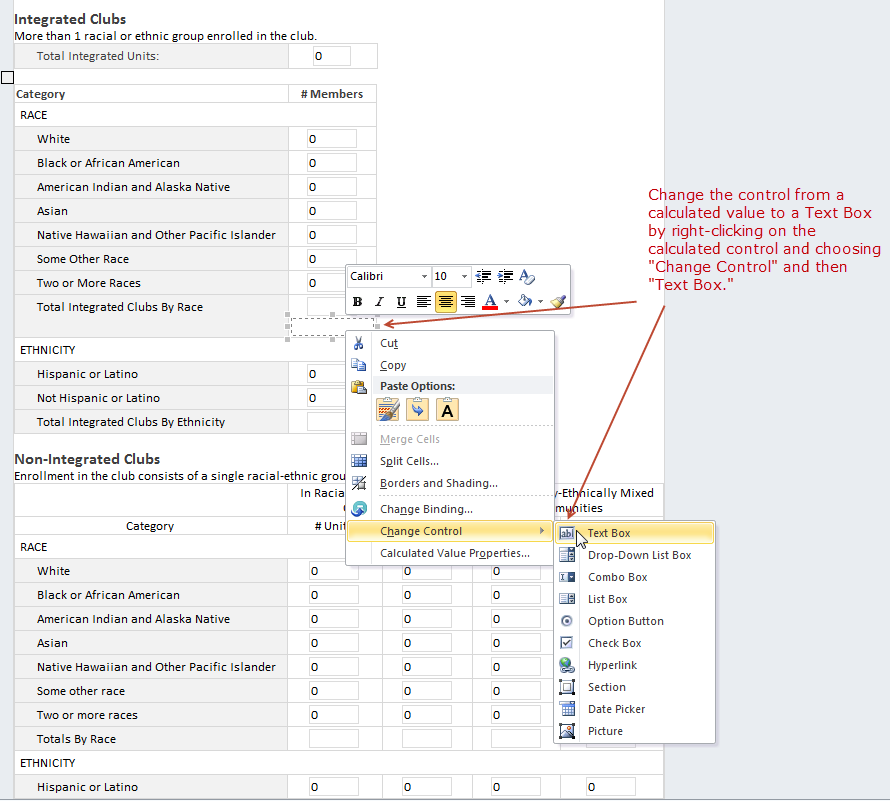
    This is fairly easy to fix. You can simply change the control to a text box and you’ll get your validation formatting back.

    Change the Calculated Control to a Text Box to Restore Validation
    Change the Calculated Control to a Text Box to Restore Validation Formatting
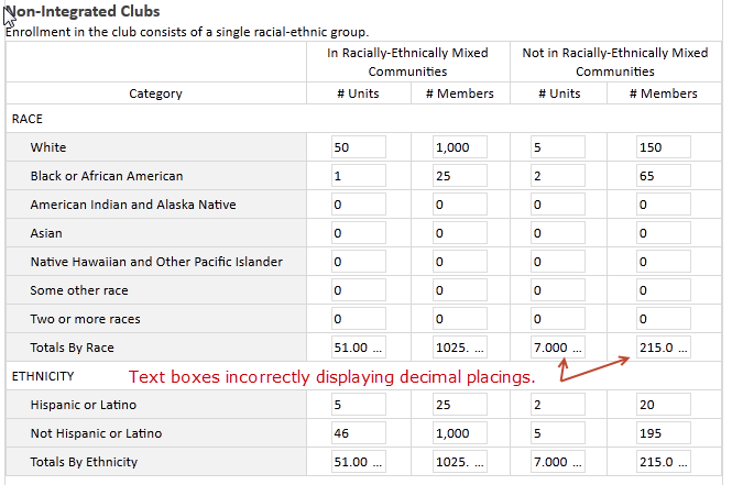
  2. But, then…. Text boxes bound to calculated columns of type “number” do not conform to the number formatting set in SharePoint.
    Text Boxes bound to calculated columns incorrectly showing decimal places.
    Text Boxes bound to calculated columns incorrectly showing decimal places.

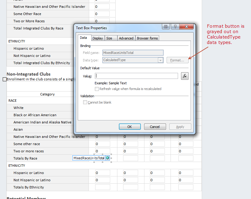
    And, of course, you can’t control the formatting of a text box bound to a calculated column.

    The format button is grayed out on text boxes bound to calculated columns.
    The format button is grayed out on text boxes bound to calculated columns.

The Work-Around

There are a couple of potential work-arounds.

Option 1

Don’t use calculated columns when you’re customizing a list with InfoPath forms.
The benefit of doing this is that you can use text boxes set to read-only in the Infopath form and rules on another field or fields to run your calculations. You get all the formatting control you want, and validation formatting will display correctly. You will be storing a static value instead of having SharePoint run calculations behind the scenes. But, if you’re working with a content type and you’re not sure that every place it’s going to be utilized will be using InfoPath forms, you’re now relying on your users to do the calculations by hand, which is not ideal. And, you have to be very cautious with all your action rules in the InfoPath form to make sure you’re doing your calculations accurately. And, if a calculation changes, you’re updating an InfoPath form instead of a site or list column. Because I’m using content types and all these calculated columns are site columns, I chose to keep them as calculated columns.

Use Form Load rules to format numbers on load.

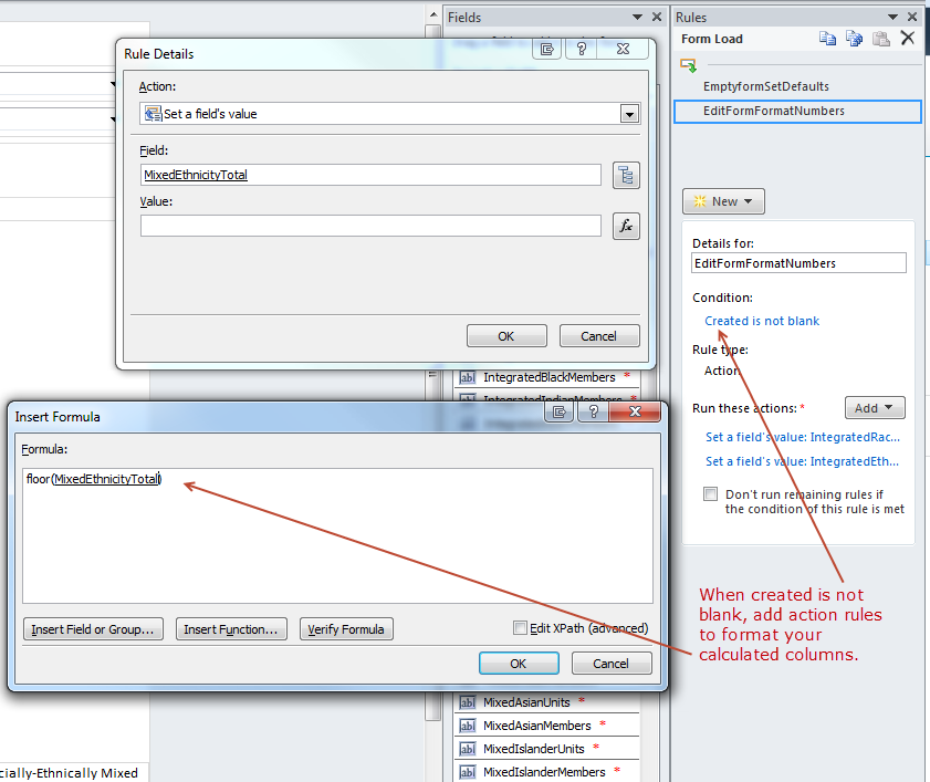
InfoPath doesn’t seem to have any problems with a new form. The issue only seems to arise with an edit or view form. So, you can add rules on form load that checks to see if “Created” is blank. It will always be blank when a new form is opened. When an edit form is opened, it will not be blank. If it is not blank, format each of your calculated columns.

Format Calculated Columns on Form Load

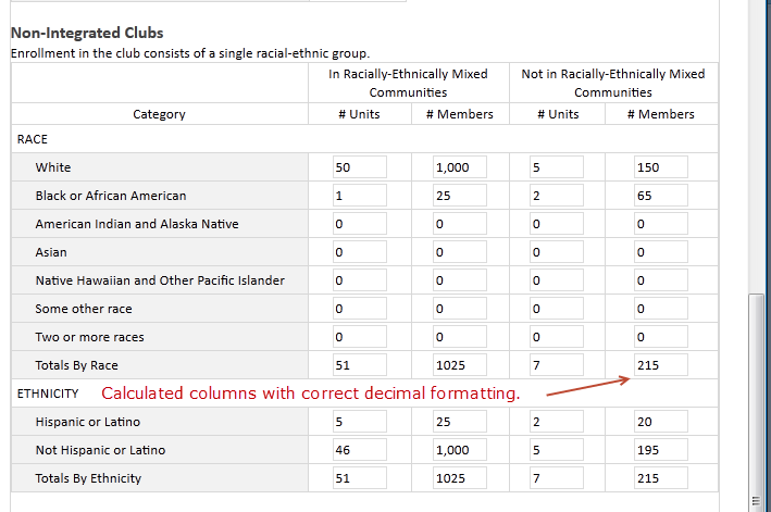
In my case, I know that InfoPath is just padding my numbers with a decimal point and a bunch of zeros. So, I can use a simple floor() function to knock off all the decimal placings and return a whole number. (I could have also used ceiling().)

The edit form now correctly displays whole numbers for my calculated columns.

After adding form load rules, fields display correctly.


There may be other gotchas I haven’t found yet. Have you found any?